This week's dropSmall batch weeklyOnly made with natural ingredients. Real butter, rich chocolate, baked with care.Soft inside, golden outside, baked fresh.
Warm cookies.Clean launch.
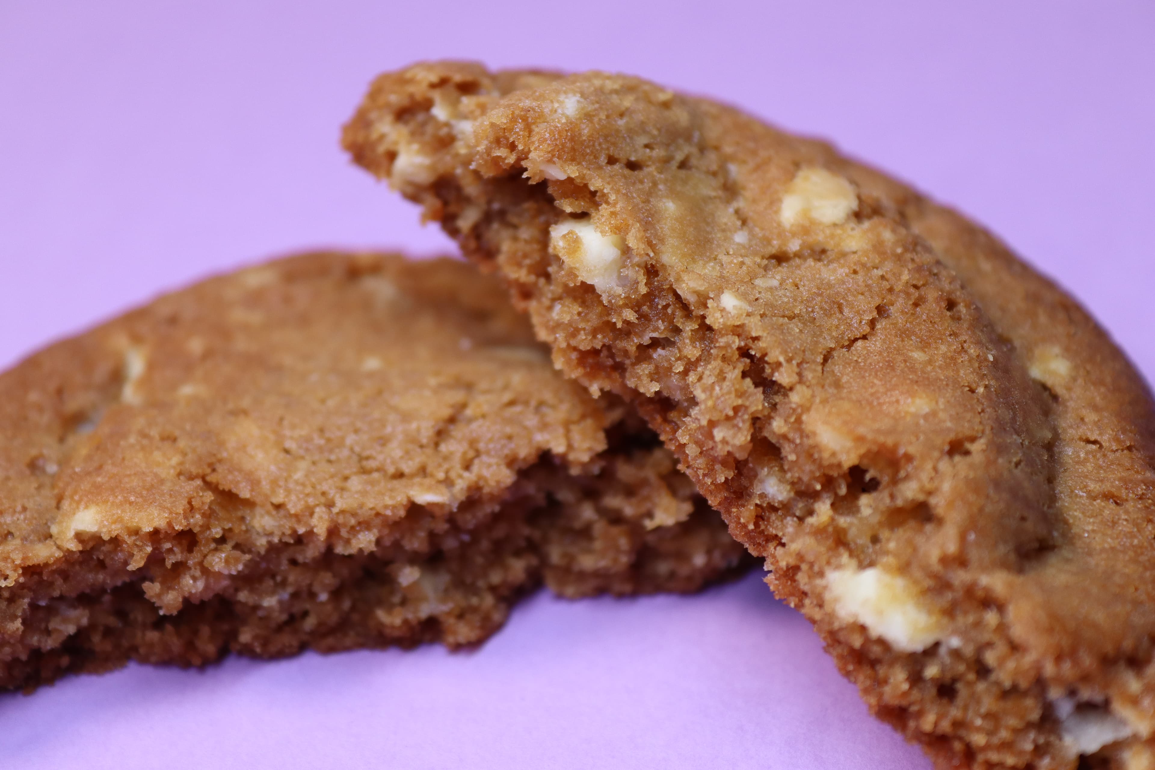
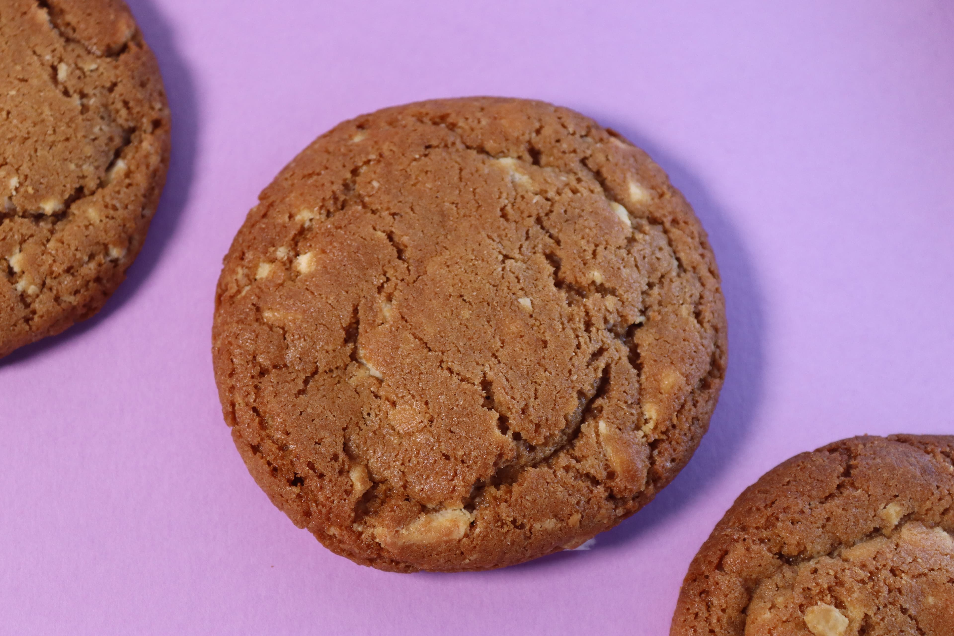
Soft centers, glossy chocolate, and close-up texture that feels premium before the first bite.
Featured
View allStrong flavours. Clean presentation.
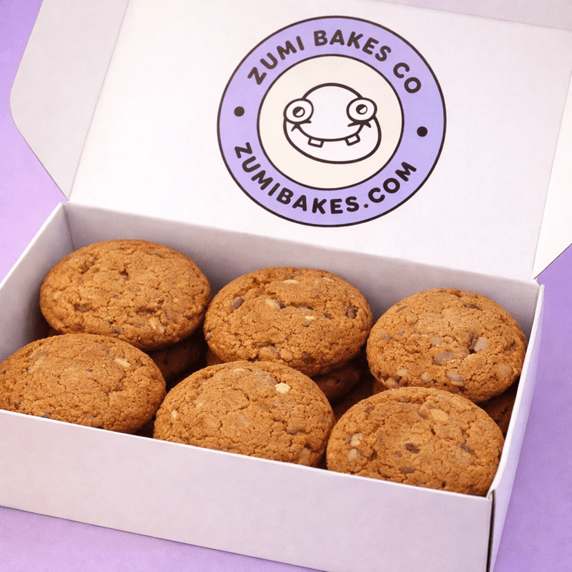
Peach Chip Cookie Box
£18
Six thick, golden cookies with melted chocolate chunks. Soft inside, lightly crisp outside, baked fresh in small batches.
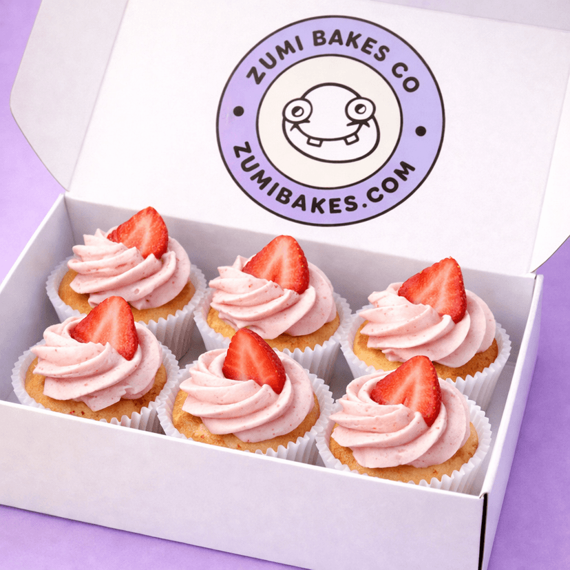
Strawberry Cloud Cupcakes
£22
Light vanilla sponge topped with smooth strawberry cream. Finished with fresh strawberry slices for a soft, airy bite.
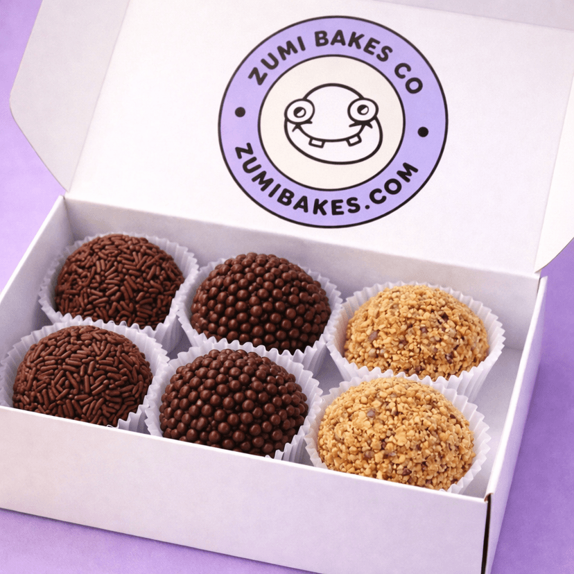
Classic Brigadeiro Trio
£14
Rich chocolate brigadeiros rolled in sprinkles, pearls, and crushed nuts. Soft, fudgy, and made to melt in every bite.
Reviews
People come back for these.
★★★★★
“The packaging looked premium, the cookies stayed soft, and the whole order felt like a real brand experience instead of a hobby bake.”
Amelia R.★★★★★
“The brigadeiros disappeared first. The site made ordering feel easy and the product photos were strong enough to sell the box immediately.”
Theo K.★★★★★
“ZUMI feels playful without losing quality. It looks like a bakery you'd actually trust to send as a gift.”
Mina L.Handmade
Small-batch desserts with rounded, polished presentation.
Fresh
Built for immediate cravings, gifting, and repeat orders.
Premium
Controlled color, soft shadows, and a clean DTC feel.
About ZUMI
Clean visuals. Stronger product focus.
ZUMI is built to make cookies feel premium before the first bite. The product, the visuals, and the experience all work together.
Read moreWhy this feels better
- Clearer hierarchy
- Better spacing
- Stronger product focus
- Less layout hacks
Order now
Pick your favourites from the latest batch.
Strong visuals matter, but the point is simple: make the product look worth buying.